Architectural Color Consulting

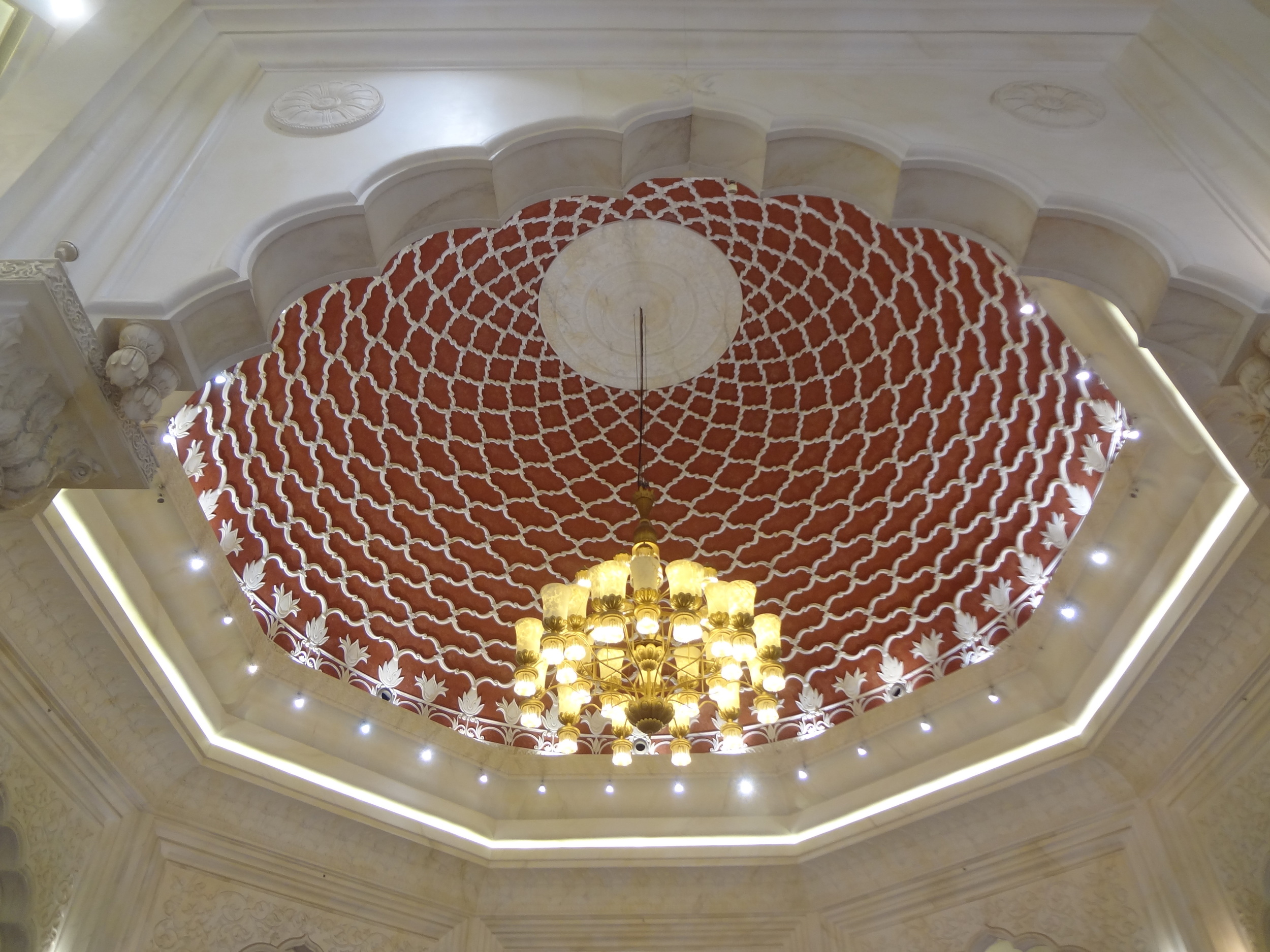
My new passion, red with coral

My new passion, red with coral

I discovered my new passion for red and coral two weeks ago. Struck by the beauty of this combination in a dupatta (long piece of cloth worn around the head, neck, and shoulders by women from South Asia, typically worn with a long shirt and baggy trousers), I was urged to buy it. My next thought was, “This duo would look stunning in a home!”

Read More

Are dark colors dark?

While Benjamin Moore (BM) announced Simply White as the color of the year 2016, it is already talking about darker color trends much before the year ends. In fact BM’s color of the year 2017 is Shadow, a moody shade of purple and one of the 27 colors trending next year.

benpalette.jpg

With mysterious properties, Shadow seems as though it is meant for those who are not afraid of color changes as per the quality of light flowing into the room.

Lets look at this purple room in the afternoon light.....

….And now at sunset.

Dark colors for a living space have been discussed for a long time and after consistent research over the last few years they have earned their rightful place in our lives.  For example, Sherwin Williams advocated Exclusive Plum for the year 2014 and Pantone launched Marsala in 2015. 

Exclusive Plum

Exclusive Plum

Marsala

The idea is to create mood and drama with dark colors. They tend to give an impression that one is ready to experiment and go beyond the comfort zone of neutrals.

And the cherry on top is: dark colors make smaller rooms seem bigger, corners feel cozy and private and a not so well lit space, look stunning.  

Using white paint or neutrals in a small room or in a place that lacks light is going to make it look dull and sad. Would this all white bathroom work for you?

BM’s trending color palette is a combination of earthy hues and dark colors. Pair the dark colors with neutrals and you get some attractive matches to suit your style and home. Color trends lend perspective and open up our mind and what matters is picking the color that makes us feel happy, energized and comfortable.

Would you paint dark colors for your room?

Are you in awe of color?

Recently, I did a color consultation for a client who said, “We are not afraid of color”. I was pleasantly surprised to hear this. Interiors of homes in the UAE are usually painted in light neutrals for two distinct reasons. One, geographically, light colors beat the heat and gel with desert hues. Two, psychologically, white, off-whites, cream, beige are low-key and sober.

I toured the villa they were currently staying in and observed their color choice and sense of design. The couple’s personal style was muted, yet the living room wall had a classic rich shade of mauve with a tone of gray to emphasize the tall ceiling and large space.  They made good use of beige as well to go with some of the oriental dark wood furniture.

We then walked through the new villa they were going to move to after their summer holiday. It is a beautiful courtyard house close to the beach and the mud exterior with wind towers took me back to the old days. The two-storied house had five bedrooms, living and dining, kitchen, open TV space and a terrace on top.

I was waiting for this moment - to experience my client’s love for color. The icing on the cake was how the couple, like me, would have only Benjamin Moore color in their home. I was joyous and all set to pick my color palette.

In natural daylight, I put up one or two color samples on the walls and trim of each room. I made suggestions that were mindful of their color dislikes. 

My client made quick choices.  She agreed on the hallway and woodwork colors and that only the bathroom doors would be painted.

The final palette was warm. Pink that was calming, mid-tone lavender with gray that made one feel grounded, shades of beige that were quiet, yellow to brighten, and cheer and blue to bring cool and calm.

The “connecting” color was Sugar Cookie, a creamy off-white with the toasty warmth of freshly baked sugar cookies.  It looks a pale, slightly yellow shade that reminds you of soft, smooth butter. It was used for all the ceilings, woodwork and metal window frames.

The exception was the playroom. The walls were cool yet vibrant blue, the trim was white and a less vibrant blue shade was used on the ceiling. One wall was finished with Chalkboard paint in the same color.  

Playroom – Ceiling: Turquoise Haze; Trim: white; Walls: BM Cayman Blue

Their daughter who has blue eyes, loves the color blue, so her bedroom was also another shade of blue.

Child’s Bedroom: Ceiling: BM Sugar Cookie; Trim: BM Crystal Springs; Walls: BM Skyscraper

The color scheme in three out of the five bedrooms was the same. The ceilings in the office, guest room and child’s bedroom was painted Sugar Cookie, while the trim color was a shade lighter than the shade of the wall color.  

Office : Ceiling: BM Sugar Cookie; Trim: BM Paisley Pink; Walls: BM Paris Romance

The walls in the hallway were San Pedro Morning, a timeless, elegant yellow; ceilings and staircase sidewalls were painted Sugar Cookie to go with the black wrought iron railings. 

Top and bottom left : Open TV space; Walls: BM Bayshore Beige  | Top right: First Storey Corridor; Walls: BM San Pedro Morning| Bottom right : Stairway: Ceilings, Railings and staircase sidewalls: BM Sugar Cookie

The living and dining room walls were Bar Harbor Beige. An elegant color again. We used it to cover the tray ceiling and give height to the room. A small egg shaped ceiling and trim embedded in the tray ceiling were painted Sugar Cookie. 

Top : Living area; Bottom: Dining area; Walls; BM Bar Harbor Beige

The ceilings in the open The TV space and the Master bedroom were treated like the living and dining area.

Master bedroom: Walls: BM Sandlot Gray

The kitchen had tiled walls and floor with a yellow undertone. We painted Sugar cookie on the ochre brown wood cabinets to match the tile color. 

Kitchen- BEFORE

Kitchen - AFTER

Overall, the entire palette offset the cream tiled flooring and molding through the house.

The painters plodded for three weeks. During this time, I saw the truest of colors in some of the rooms while other rooms felt warmer depending on their exposure to daylight.  At night, the rooms felt less warm. 

What mattered most was that the house was now a home; a home that reflected the tranquility and sense of permanence of it surroundings; a home that the family enjoyed living in.


Dubai's Journey of Color

Dubai has been my home for 20 years, a city that holds a special place in my heart. It is here that I have achieved a sense of freedom, treasured milestones, and personal successes. There couldn’t be a better reason for me to pay my love and respect to this ever-surprising city through my love for color.

Color is the most basic medium of visual appeal. It transcends into every part of life, in things we eat, play, work or do to just relax with.  

Our association with color in more ways than one is innate and is a reflection of our personality, style and even moods. Unwittingly it gives us a certain character and a means to identify with. And just as it defines us, it defines cities as well.

Dubai has travelled a journey of color that befits the city’s growth over time. When it was established as a city in its own right and started shaping up, houses, buildings and mosques wore variations of neutrals or shades of grey, beige, cream and off-white.

It seemed as if the city was a unified stretch of desert expanse depicting the “Colors of our Land.” The city held its own in these humble yet proud beginnings, and to this day it has not forgotten its roots. And forty-five years later it has evolved to a modern city in the sand. For example, here is the recently opened Four Seasons.

The colors of the city have become just as vibrant as it is. Welcoming warmth and vigor are felt in Dubai’s version of the Box Park of London.

But one also sees creativity, innovation and an attitude of having arrived through the bright red, green, blue and yellow boxes cordoned by a row of colorful pillars and Palm trees. Somewhere a space is intentionally created to house a red croc and pink penguins which seem to break the monotony of sharp design. 

DSC05433.JPG


Normal
0


false
false
false

EN-US
JA
X-NONE


 <w:LatentStyles DefLockedState="false" DefUnhideWhenUsed="true"
DefSemiHidden="true" DefQFormat="false" DefPriority="99"
LatentStyleCount="276"…


At some distance from the Box Park, on a busy avenue, is another colorful feast. One of a kind, the City Walk incites a discovery into its journey of colors while luring you to spend long cool evenings in a variety of cafes and restaurants. And there’s more coming to this big time getaway!


Fireworks on New Year’s Eve showed a riot of colors, with shades of Marsala thrown in, as if it were honoring Pantone’s choice of color for 2015. 

Yet again in the youthful and energetic colors of modern Dubai, flows stylish elegance. Neutrals are still seen in fine dining restaurants while vivid blues combined with beautiful design depict some of the finest mosques and malls in the city.  In a way, an ever-evolving Dubai is continuously created through experimentation with color. 

Cool blue and green glass buildings are a common feature in a mix of warm pink glass buildings.

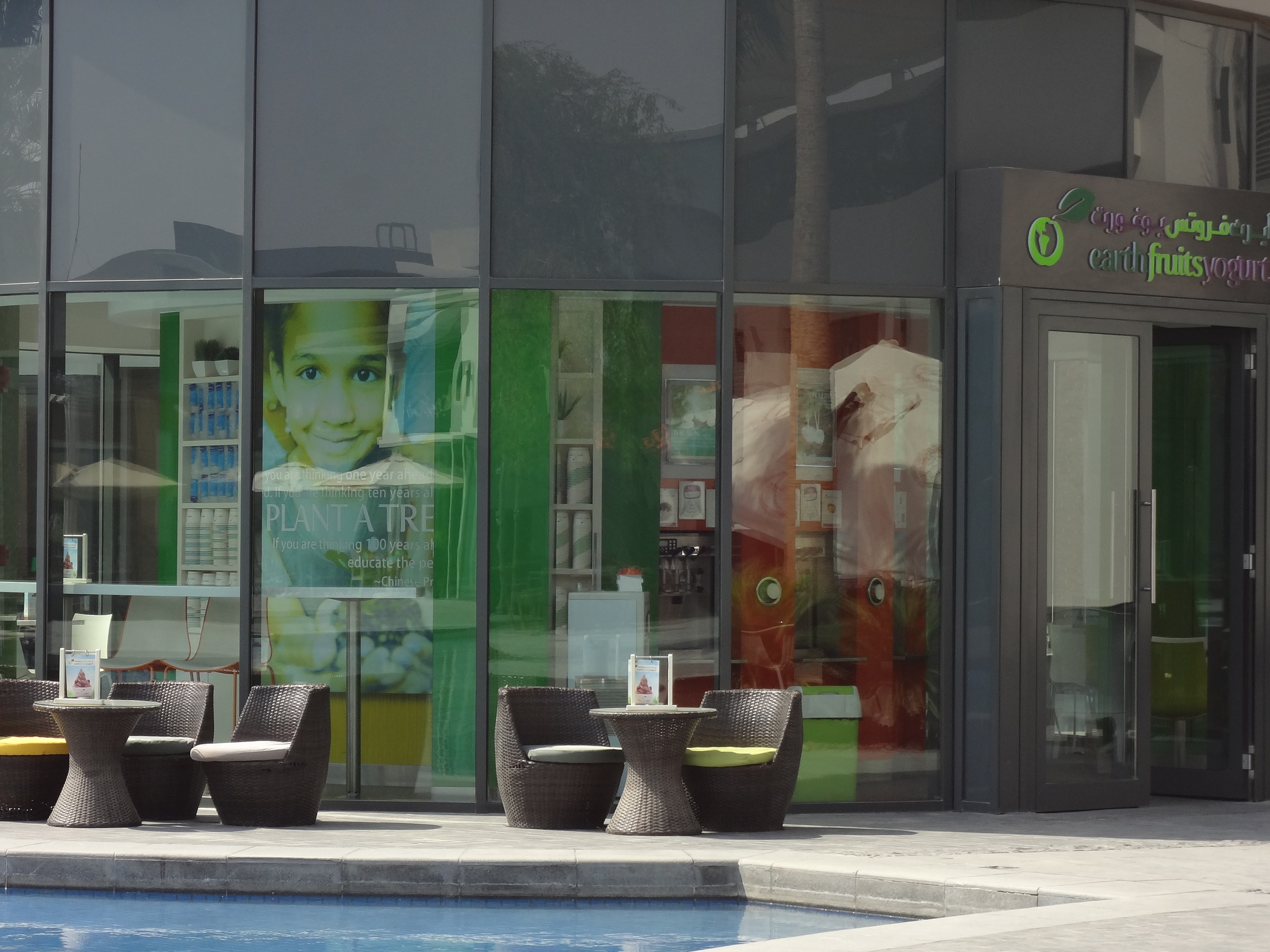
Colors go well with the architectural theme of schools, shopping malls and parks. In this innovative style of a kids' nursery here, one can sense the enduring comfort and warmth of colors.

The Ibn Batuta mall, a signature mall, is regionally inspired with a combination of bright colors and modern design in many ways.  

The Starbucks here takes on the regional modern concept of store design while creating a calm respite from the busyness.

Geared towards making an indelible mark on the globe, Dubai’s futuristic vision has anchored itself in myriad expressions of color. It is a city that is a visual delight in the day and at night.