Trying my hand at a design board

My blog, three weeks ago, set me up to create my first design board. I got cracking but not before I put a clear plan in place. There was a lot to be done.

Step 1

I was not deterred by the lack of materials. With best friend Google in tow, I found reputed flooring (wood and tile), carpet, upholstery and curtain suppliers and set up appointments with them. Once I chose a variety of samples, the friendly and helpful team ordered them from their warehouse. I collected a bunch of samples from each of the 5 suppliers on my next round of visits.

Organizing a floor plan was easy. A huge thanks to my architect friend for promptly sharing a hypothetical floor plan for a 2-bedroom apartment from his archives.

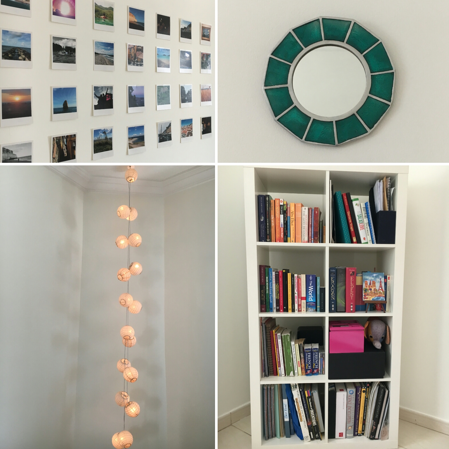
I was super excited with my sample collection and couldn’t wait to fit the material in the intangible space. Now there was one mosaic tile that I loved, but couldn’t find the right spot for it.

Step 2

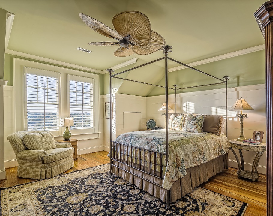
Next, I put a vision in place. I thought a family of three living in this two-bedroom apartment would be ideal. Even so, the idea of an early to mid forties couple with their 17 year old daughter in the space worked well. I imagined personal style, location of their home, color preferences and geographic orientation. In essence, I loved the concept of a minimalistic style with eclectic bits thrown in. While the family are not afraid of color, they stay away from bright colors.

Step 3

I picked a paint palette and began coordinating the samples with the color scheme. In spite of having a wide array of material, I needed to fill the gaps. The only option now was to look for images online, however choosing from the plethora was a challenge. After a laborious week, I was pleased I got the concept materials I wanted. 

Step 4

Shopping for grey and white foam boards, black and white chart paper, a retractable knife, special glue, and a wooden scale was next on the list.

Step 5

With the prep out of the way, I was geared to roll up my sleeves. This meant sizing and cutting the white foam board in rectangular or square pieces that were almost a quarter of an inch larger than the samples. Once this was done, I cut the black or white chart paper to fit the foam board pieces and then glued them together. I then glued the samples on the finished pieces to show a white or black border around the sides.

Though it was painstaking process that called for loads of patience, I enjoyed every moment of it. 

Step 6

Next, I arranged the samples on the design board. With the visual appeal sorted, I glued the samples, floor plan and palette on the board, labeled the items, and made a title and legend. And the design board for the living room was ready.

I repeated this step and created the second design board with concept materials for the master bedroom and kitchen.

And then the third design board for the daughter’s bedroom fell in place.

It was wonderful to see the bits and pieces coming together. I felt intense happiness and a sense of achievement at the end of the project. What do you think of the concepts? Would love to know!

Write to me - shailaja@colorsworth.com

Instagram - colorsworth

Facebook - ColorsWorth

Getting ready for my design board

I am all set to work on my design board. And then I thought visualizing the way I want it to go would make this exercise fast and furious (hopefully)!

So I picked color schemes screaming for a makeover, put some gorgeous tile samples together and created a new look. I was excited by the whole idea and here I am taking it on as if it were a live project!

Let's look at Remodel A.  The wood color in this pic is pretty and soothing. Period. Everything else in this space is off. Don’t you agree?

I imagined a harmonious blend of styles to create energy and appeal. My take on this would be to:

1.       Paint the cabinets and wall area in Timid White, BM OC- 39

2. Replace the backsplash with a vintage greenish grey tile

3.   Replace the countertop and island top with a wave patterned marble

4. Replace the invisible floor with stained hardwood planks (An expensive proposition nevertheless).

What do you think of the perspective?

Remodel B is also a kitchen. The cherry oak cabinets look great and then it goes awry.

To set the comfort and balance right, I would first:

1.       Replace the entire backsplash with beige and off-white tiles in check pattern. Don’t you think the rough look would be cool against the wood’s smooth finish?

2.      Replace the countertop with beige marble

With silver appliances, cream and red dinner plates and light beige or off white rectangular marble flooring, the job would be done. How about this?

Remodel C:

The design is functional so I would work on the colors to maintain the spark the simplicity.

The options are:

1.       Paint the wall with White Opulence, BM OC -69

2.      Replace the backsplash with silver and grey mosaic tiles

3. Redo the cabinet in taupe wood

4.     Replace the cabinet top with grey marble 

What do you think of the overall look?

I had fun playing with color and am feeling inspired. How about you?

Write to me - shailaja@colorsworth.com

Instagram - colorsworth

Facebook - ColorsWorth

Some TLC for your room’s sixth side

We have grown up with the impression (presumably) that ceilings must be white. Even so, my daughter who is a product of the millennial generation can’t think any different.

Recently she decided to paint her room white, which meant the ceiling and trim had to be white too. With plain white furniture already in the room and zero texture, I had to contrive.

The floor tiles in her room had a yellow undertone, so my options for white must have a yellow undertone. I picked two options and suggested the lighter off white (my “trust me I am color consultant’ hat was convincing). We went with BM OC-122, Cotton balls. It was an off- white that would appear almost white in her well-lit room. While the bright white ceiling and trim was untouched, I was happy that the overall effect was not dull and boring.

The essence was minimalism yet pops of color made the space livable and warm.

How about this bedroom below?  The walls and ceiling in one color make the room appear larger than it is, enhancing every piece of décor.  What if the ceiling was also white?  I can imagine the eye resting on patches of color and the beauty of the décor and design getting lost in the mix.  

green bedroom.jpg

Tender loving care (TLC) towards the ceiling will create incredible appeal. How about a wooden ceiling, wooden windows and décor combined with white and black….?

….Or a white and wood ceiling coordinated with wooden flooring, staircase and white walls? Don’t you think a variety of texture in this living room makes it more interesting?

Industrial design in coffee shops and restaurants seems to be trending. What do you think of this “dressed-up” white ceiling?

When ceilings are ornate or busy with crown molding, the design elements need to stand out. Here, white would do the job. Of course there are churches, palaces, mosques and museums where you want to stare at those artistic and colorful ceilings forever.

Dark furniture, for instance cherry oak, would work well with white walls and ceiling. On the other hand, what do you think of pleasing pastel color combined with white to bring out the ceiling elements in the hotel below? Don’t miss the marble border above the trim connecting with the pillar so that it is not singled out.

If you want yellow walls, then white would work on the ceiling. In this older home below, don’t you think the white and yellow are well balanced? I love the crown molding on the wall; it takes away any overt attention from the ceiling.

High ceilings create a formal environment in a traditional or modern home. For warmth and coziness, you could have a dark ceiling to lower the room’s height while white walls give largeness to space. Do you think this innovative shophouse in Southeast Asia though expansive, creates warmth?

How about you? What color would you pick for your ceiling?

Write to me - shailaja@colorsworth.com

Instagram - colorsworth

Facebook - ColorsWorth

Accessories to accent

Accessories to accent

Color design completes a full circle with eye-catching accessories. They make a difference whether it’s a stool, a rug, pillows, shelf, dresser or just flowers and fruits.


Take a look at the bedroom below. Each décor piece holds its own yet blends in with the one next to it. Think about this – Although the colors are different, the neon pink dotted box offsets the fuchsia pink flowers and the brown vase looks great next to the red-brown lamp base. The white side table is perfect with the lampshade. And then these hues flow through the pillow, again in different shades, enhancing the calming green, grey and white.

Read More